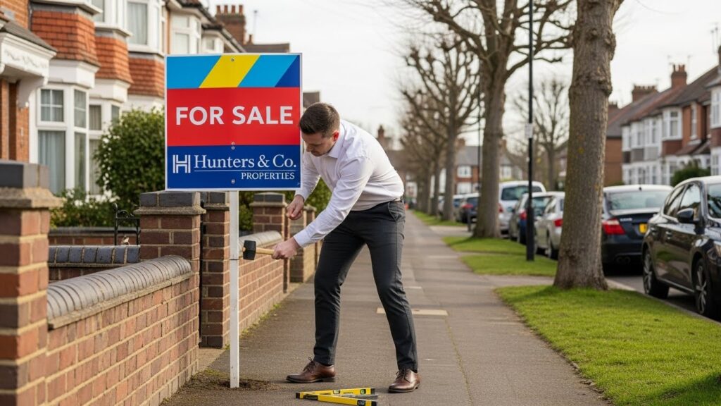
Many people look for new homes across the UK, and the market keeps shifting daily. First impressions matter very much when people view properties in busy areas. Good signs still help many buyers or tenants notice homes while exploring neighbourhoods. Online listings help, but printed boards still remain important for property visibility today. Many reports show that a strong physical sign can drive up to twenty percent of enquiries. This proves that design quality still plays a major role in property marketing for all agents. Businesses in Cheshire also depend on clean boards to reach people passing busy local streets.
Why Sign Design Matters in Property Marketing
A clean and simple design captures attention quickly during neighbourhood drives. People look at homes while walking or driving, so clear signs matter greatly. Many people still follow property signs when exploring new locations for possible purchases. Research on outdoor ads shows that clear colours and shapes help faster responses. Simple elements help buyers notice listings even when many boards appear nearby. Many local agents explore estate agent boards in the UK for inspiration and general style ideas. They choose layouts that guide the eye easily toward key details like phone numbers. This approach helps homes stand out during crowded market conditions.
The Role of Property Sign Visibility in Attracting Buyers & Tenants
Visibility plays a major role because people cannot enquire about signs they cannot see. Homes placed near busy roads sometimes lose attention because of poor design or angles. Many properties also sit behind hedges, making weak signs less readable from the street. UK agents often adjust colours and placement to increase property signs’ visibility across different neighbourhoods. A brighter colour contrast often improves readability from long distances during cloudy weather. These small changes increase interest because people feel more confident when the signs are clear. Better visibility boosts phone calls and messages from interested buyers or tenants quickly.
What Makes a High-Impact Property Sign Design?
Good signs follow clean layouts that keep information simple and readable. Designers avoid clutter and choose strong colours that stand out against outdoor backgrounds. Outdoor research shows that people only look at signs for two seconds on average. This makes a high-impact sign design very important for faster recognition in busy streets. Many designers use simple fonts and bold shapes to highlight the key information instantly. Some teams also follow layout guidelines found in professional sign design resources. High-quality printing helps keep signs bright during rain or strong sunlight in the UK. These steps keep boards fresh and professional for longer periods. Key elements of strong signs include:
- Clean layouts that avoid confusing text clusters
- Strong colour contrast that improves long-distance visibility
- Durable materials suitable for local wind and rain
- Fonts designed for quick reading from cars or pavements
Why Estate Agents in the UK Still Rely on Printed Boards
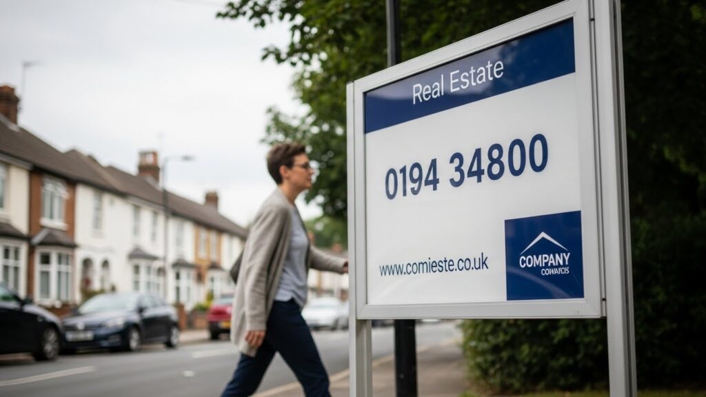
Online listings help many people, but printed boards still influence local decisions. Many buyers first discover homes while walking or driving around neighbourhoods near their workplace. Boards also reinforce branding for agents who want stronger local recognition. People trust agents more when they see consistent boards across nearby streets. Many guides on real estate boards UK explain why physical boards still encourage spontaneous enquiries. These boards also help older customers who prefer physical signs instead of digital browsing. Outdoor property signs also stay useful for tenants who decide quickly during area visits. This is why printed boards still remain essential for UK property marketing.
How Better Sign Design Leads to More Property Viewings
Better design builds trust because clean boards make listings feel reliable and professional. People want homes handled with care, and tidy signs reflect that first impression well. Research on outdoor ads shows that strong signs increase message recall after viewing. People who remember signs often send enquiries later, even after returning home. Property marketing signage helps guide people toward the correct contact person easily. Good boards also help reduce confusion between multiple listings on the same street. A polished look encourages more confidence, which leads to more property viewings naturally.
Common Mistakes in Real Estate Board Design (and How to Avoid Them)
Many common mistakes reduce the effect of property signs and limit enquiries. Avoiding these issues improves reach and boosts interest among local buyers or tenants. Most problems come from design errors, low-quality printing or bad placement choices. Common problems include:
- Overcrowded layouts that hide key details behind unnecessary elements
- Weak colour contrast that becomes unreadable during cloudy UK weather
- Small text that cannot be read from moving vehicles
- Poor placement behind hedges, trees or walls
Fixing these mistakes improves engagement because people notice signs more easily. Simple choices guide the viewer’s eye naturally and help them find contact details quickly.
Why Choose Zero Signs for Real Estate Boards in the UK?
UK agents want consistent printing, strong materials and clean design quality for all boards. Wind and rain often damage weak boards, so strong materials matter greatly for branding. Zero Signs offers reliable custom real estate boards made from durable sheets and bright inks. The company’s range includes options for sizes, layouts and colour combinations. Many professionals across Cheshire choose Zero Signs for eye-catching signage UK designs with strong visibility. Zero Signs’ reliable production helps boards stay fresh during long outdoor exposure in all seasons. This improves brand identity and helps homes stand out across busy property markets. The company’s experience supports agents who want sharp boards with strong property branding features.
Conclusion
Strong design plays a much bigger role in property marketing than many expect. People still rely on printed signs during neighbourhood drives, even with many online options. Clean layouts, strong colours and smart placement raise visibility quickly in competitive markets. Better design also improves trust because professional boards make listings feel organised. These advantages lead to more property viewings and stronger engagement across the UK.Those wanting better design ideas or new board options can browse for sale boards design collections offered by Zero Signs. People can also explore Zero Signs’ wider signage services or contact the team for guidance on materials, layouts and styles.