First impressions begin the moment someone enters a workplace or commercial building. Clear door signage helps people feel confident, welcomed, and guided without confusion. In the UK, businesses rely on smart signage to support daily operations. Good door signs improve movement while reinforcing professionalism and brand trust. Choosing the correct font and finish makes signs readable and long lasting. Poor design choices often confuse visitors and result in repeated questions from visitors. Modern offices now prioritise accessibility and visual clarity across internal spaces.
Strong door signage design supports navigation while reflecting a company’s values and professionalism. In busy offices, readable signs reduce stress and improve visitor confidence. UK workplaces increasingly focus on accessibility and inclusion within interior spaces. Door signs must remain clear under artificial lighting and daily wear. Thoughtful design ensures signs match branding and workplace tone. Clear fonts and suitable finishes also support compliance requirements. These small design decisions influence how people perceive your business environment.
Door signs guide employees, visitors, and clients through shared spaces. They quietly shape daily experiences without drawing unnecessary attention. Well-designed signage blends function with visual harmony across interiors. Businesses in Cheshire increasingly invest in signage improvements for better efficiency. Selecting appropriate fonts and finishes helps maintain consistency across office environments. Good signage supports productivity while reinforcing company identity.
The Role of Door Signs in Offices and Commercial Spaces
Door signs organise movement and reduce interruptions within busy office environments. Clear identification prevents people from entering the wrong rooms or interrupting meetings. In the UK, offices with structured signage report smoother daily operations. Well-placed signs reduce repeated questions and staff distractions. This improves efficiency and creates a calmer working atmosphere. Effective office door signage supports authority and privacy in sensitive areas. Meeting rooms, executive offices, and restricted zones require clear identification. Door signs signal importance and boundaries without verbal explanation. This visual clarity helps maintain professional workplace conduct.
Door signs also support visitors unfamiliar with building layouts. Clear wording and placement reduce anxiety during first visits. UK office studies show reduced wayfinding errors with consistent signage. Signs placed at eye level improve recognition and reading speed. Businesses benefit from fewer delays and better visitor experiences. Commercial spaces also rely on signage for safety and organisation. Door signs help distinguish staff-only areas and customer-accessible spaces. This separation improves security and operational flow. Consistent signage creates trust and confidence among visitors. Door signs play a silent but essential role across commercial interiors.
Choosing the Right Font for Readable Door Signs
Font choice directly impacts how quickly people understand door information. Simple fonts improve recognition and reduce reading effort. Sans-serif fonts remain popular across UK offices for clarity. These fonts stay readable at different distances and lighting conditions. Good typography supports readable door signs in busy corridors and shared spaces. Complex fonts slow reading and increase confusion. Clean fonts help people process information quickly while walking. UK design research shows simple fonts improve recognition time significantly.
Font size also matters for readability and accessibility. Small text forces people to stop and lean closer. Larger text supports faster navigation and reduces frustration. Consistent font sizing across signage improves visual harmony. Spacing between letters and words affects readability equally. Tight spacing makes signs harder to read at a glance. Adequate spacing improves clarity and visual comfort. Door signs should avoid decorative or handwritten fonts. These styles often reduce legibility in professional environments.
Choosing the right font supports professionalism and functionality. Fonts should align with brand identity without sacrificing clarity. Balanced typography ensures signs remain effective over time. Good font selection improves daily movement and workplace efficiency.
Accessibility Considerations for Door Sign Fonts (UK)
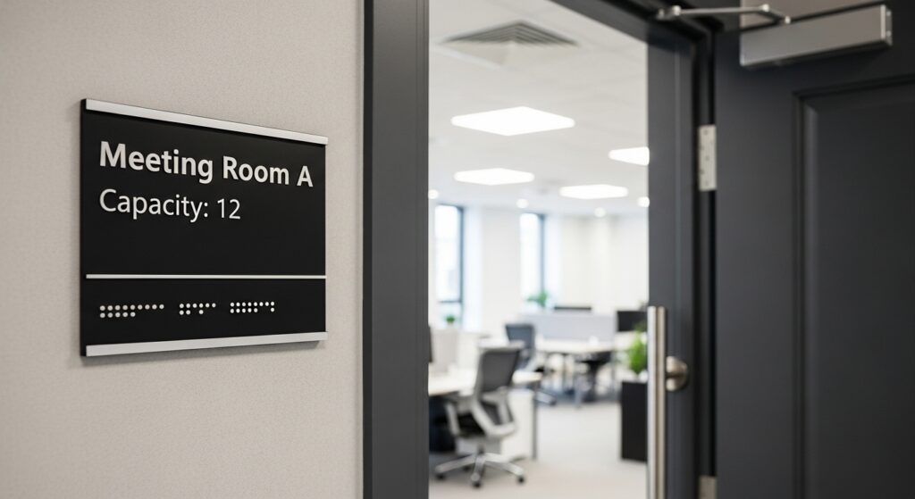
Everyone can move around areas safely and independently thanks to accessible signs. Commercial interior design should be inclusive, according to UK guidelines. Door signs should support users with visual impairments. Fonts must remain clear, simple, and highly readable. Strong contrast between text and background improves visibility significantly. Light text on dark backgrounds often works well indoors. Avoid low contrast combinations that strain eyesight. Accessible design supports accessible door signage UK expectations.
Decorative fonts reduce clarity and accessibility compliance. Simple sans-serif fonts remain the safest choice for inclusivity. Letter spacing must remain consistent and generous. Crowded text reduces comprehension for many users. Tactile and raised lettering support visually impaired users. Braille inclusion improves compliance and usability in public buildings. Many UK offices now prioritise tactile signage installations. These features enhance accessibility without affecting visual design.
Accessible signage also benefits everyone during emergencies or low lighting. Clear fonts help people move quickly and safely. Inclusive signage reflects social responsibility and legal awareness. Businesses benefit from improved reputation and compliance confidence.
Popular Finishes for Office Door Signs
Finishes influence durability, visibility, and overall perception of door signage. UK offices prefer finishes that resist fingerprints and scratches. Brushed metal remains popular for professional environments. It offers durability and understated elegance. Acrylic door signs provide versatility and modern appeal. Acrylic allows various colours, thicknesses, and mounting styles. These signs suit contemporary offices and creative workspaces. Acrylic surfaces clean easily and maintain their appearance. Matte finishes reduce glare under artificial lighting. This improves readability throughout the day. Satin finishes offer a balance between shine and softness. These finishes suit corporate and healthcare environments.
Finish selection affects how signage ages over time. Glossy finishes may show scratches more easily. Matte and satin finishes hide wear better. Office fit-out reports highlight reduced glare benefits. Choosing suitable finishes supports long-term signage performance. Durable finishes reduce replacement costs and maintenance needs. Finishes should match interior materials and lighting conditions. Good finish selection improves consistency across office interiors.
Matching Fonts and Finishes With Office Branding
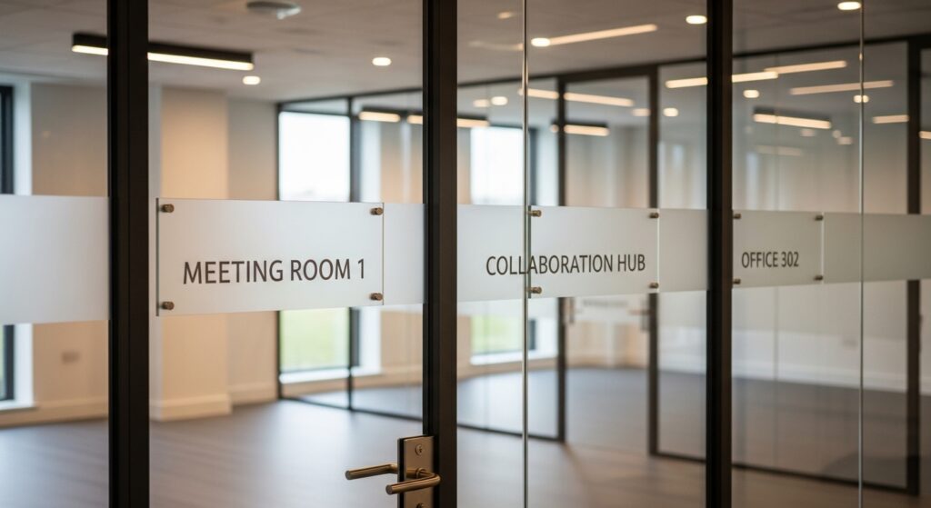
Consistent signage strengthens brand recognition across office interiors. Fonts and finishes should reflect the company’s identity and tone. UK branding studies show visual consistency improves visitor trust. Door signs play a role in internal brand communication. Matching fonts with existing branding improves cohesion. Reception signage often sets typography standards. Door signs should follow the same visual language. This supports professional office signage consistency. Finish choices should complement interior materials and colours. Metal finishes suit corporate environments with glass and steel. Acrylic works well in modern or creative offices. Matte finishes support understated brand identities.
Consistent design improves wayfinding and visual comfort. Visitors feel more confident navigating familiar visual patterns. Employees benefit from predictable and organised environments. Brand-aligned signage supports long-term workplace identity. Door signs become part of the overall brand experience. Thoughtful design reinforces professionalism without overwhelming interiors. Consistency across signage builds recognition and trust over time.
Practical Design Tips for Effective Door Signage
Effective door signage balances clarity, simplicity, and visual harmony. UK designers recommend limiting text to essential information. Short wording improves recognition and reduces clutter.
- Text alignment should remain centred or left aligned consistently. Inconsistent alignment disrupts visual flow. Spacing around text improves readability and presentation. Signs should avoid overcrowding at all costs.
- Placement affects visibility and usability. Signs placed at eye level improve reading speed. Door signs should remain unobstructed by handles or frames. Lighting conditions must also guide placement decisions.
- The finish selection should suit the surrounding light sources. Reflective finishes may cause glare under strong lighting. Matte finishes work better in brightly lit corridors.
These practices support workplace signage design effectiveness. Well-designed door signs remain functional and attractive. Practical design decisions reduce future replacement needs. Clear signage improves daily navigation without drawing unnecessary attention.
Common Mistakes to Avoid in Door Sign Design
Many offices suffer from inconsistent font usage across signage. Mixed fonts create confusion and visual clutter. Consistency supports clarity and professionalism.
- Low contrast colours reduce readability significantly. Pale text on pale backgrounds strains eyesight. Strong contrast improves visibility and accessibility. Reflective finishes often cause glare problems.
- Overcrowded layouts make signs difficult to read quickly. Too much information overwhelms users. Door signs should communicate quickly and clearly. Decorative fonts reduce legibility and professional appearance.
- Ignoring accessibility requirements risks compliance issues. Missing tactile elements exclude visually impaired users. Skipping accessibility checks creates negative user experiences.
Avoiding these mistakes improves signage effectiveness. Thoughtful design reduces complaints and confusion. Professional signage supports efficiency and positive workplace perception.
How Zero Signs Creates Professional Door Signage
Professional door signage requires careful planning and execution. Zero Signs focuses on tailored signage solutions for UK businesses. The company’s approach balances functionality, design, and compliance. Font selection prioritises readability and accessibility. Material choices reflect durability and interior design trends. Layout planning ensures clarity and consistency across spaces.
Zero Signs supports custom door name plates for diverse workplaces. Each solution reflects specific operational and branding needs. Attention to detail ensures signage remains effective long term. The experience across commercial interiors supports informed design decisions. Signage aligns with accessibility standards and workplace expectations. Structured processes reduce errors and inconsistencies.
This approach ensures signage remains practical and visually aligned. Businesses benefit from reliable, compliant, and professional signage outcomes. Door signs quietly support daily operations and brand presence.
Conclusion
Choosing the right font and finish impacts navigation and workplace experience. Clear signage supports accessibility, professionalism, and brand consistency. UK offices benefit from thoughtful door sign design decisions. Small design choices influence daily efficiency and perception. Well-designed door signs improve movement and reduce confusion. Consistent signage strengthens trust across commercial environments.
Professional door signage begins with informed choices around typography and finishes. Exploring expert signage solutions helps businesses align clarity with visual standards.