Health and safety signage silently speaks where words might fail. In every UK workplace, signs use colour and shape to communicate instantly. An appropriate visual can protect life through warning, guiding, or instructing. The Health and Safety Executive (HSE) indicates that unclear or missing signages are involved in over 30% of accidents at the workplace. That number highlights how crucial proper signs truly are. British regulations require employers to use clear and consistent designs that everyone can understand. These rules make sure no worker misses a vital message in an emergency. For businesses looking for practical examples of compliant signage, Zero Signs offers detailed design collections.
The Legal Basis: Safety Signs & Signals Regulations 1996
The Health and Safety (Safety Signs and Signals) Regulations of 1996 define the appearance of safety signs at the workplace. These regulations in the UK are aligned with the EU Directive 92/58/EEC in order to ensure uniformity. Their goal is simple: any person should recognize a sign’s purpose from its colour and shape alone. Consistency assists workers in acting quickly, particularly when under pressure. These rules are critical in industries such as construction, healthcare, and fitness facilities. Legal compliance and communication in the work environment can be achieved through the use of correct signage, including that found in the Health and Fitness portfolio by Zero Signs. These visual tools contribute to consistency, avoid misunderstandings, and minimise safety hazards.
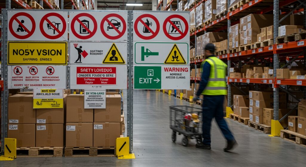
Red Signs (Prohibition & Fire Equipment): Circle & Rectangle
Red instantly attracts attention. In safety communication, it signals prohibition or fire equipment. The prohibition sign red circle, shows restrictions such as “No Smoking” or “No Entry.” Its circular design, with a white background and diagonal red bar, commands immediate awareness. Similarly, rectangular fire equipment signs are solid red with white symbols. These are fire extinguishers or hose reels. Using such visuals is vital in times of emergencies since people instinctively associate redness with danger. A 2023 HSE report revealed that visible red-coded signs reduced fire response times by nearly 20%. This improvement proves the importance of correct colour use. For businesses wanting professional examples of fire signage, Zero Signs’ guide on essential workplace visuals is a useful reference.
Yellow or Amber Warning Signs: Triangular Shape
Amber or yellow always indicates caution. The warning sign yellow triangle, indicates potential hazards to the workers, such as electricity, chemicals, or accidents like slippery floors. Its shape of a triangle is such that it is naturally catchy and, as such, proves useful in hazard warning. A UK survey conducted by the British Safety Council reveals that 80% of UK workers immediately associate yellow triangles with risk. This high recognition rate makes these signs incredibly effective. They play a crucial role in factories and warehouses where quick responses or reactions are required. Yellow triangles are to have proper visibility so that workers are aware of them and accidents are prevented. These warning visuals can be explored further through Zero Signs’ visual safety examples, showing how clear design supports prevention.
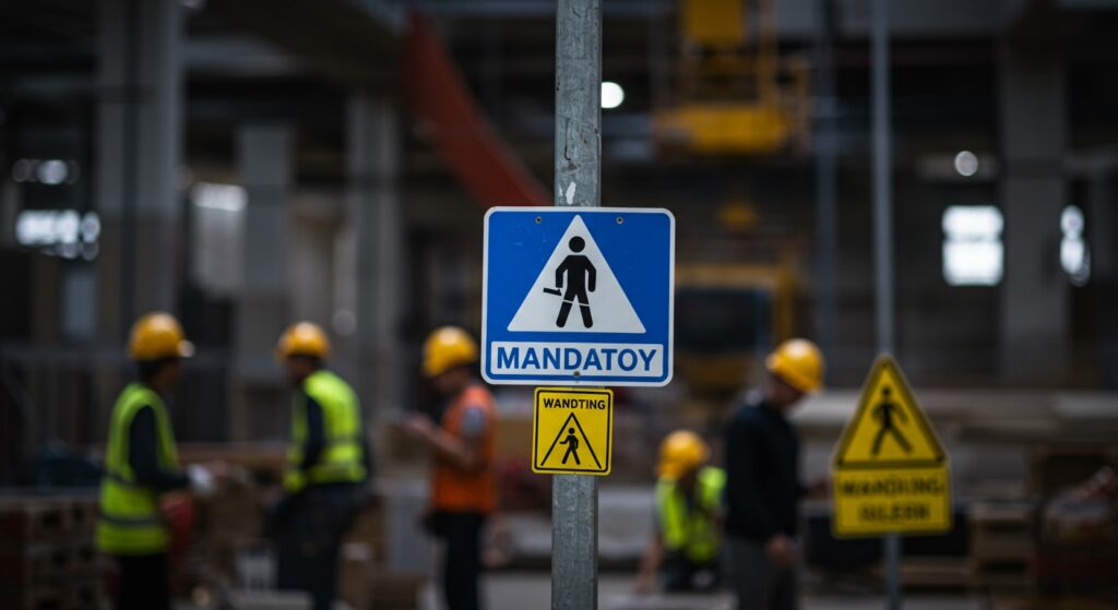
Blue Mandatory Signs: Circular with White Symbol
Blue communicates instruction and authority. A mandatory blue sign tells people what they must do for safety. Examples include “Wear Hard Hat,” “Use Hand Sanitiser,” or “Safety Goggles Required.” The circular shape adds some sense of direction and compulsion or obligation. These are part of the ISO 7010 system, which is used in UK workplaces to standardise safety messages across the world. Blue represents rules rather than warnings, ensuring compliance through clarity. Workers quickly understand what action is required just by glancing at the blue circle. These signs keep environments disciplined, reducing risks and ensuring everyone follows protocol. For an in-depth overview of required blue safety visuals, businesses can review Zero Signs’ article on mandatory workplace signage.
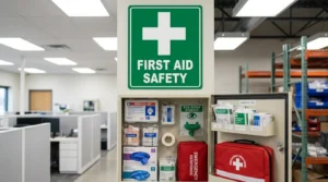
Green Safe Condition Signs: Rectangle or Square Format
Green brings a sense of safety and reassurance. The safe condition green sign identifies safe exits, first aid points, or assembly areas. These signs are rectangular or square, offering visual stability. When emergencies occur, green signs guide people calmly toward safety routes or medical help. UK safety audits show that visible green signage reduces panic by 40% during drills. This makes proper placement and visibility vital in all public and private buildings. Clear green exit signs prevent confusion during fire or power loss. For examples of high-quality, compliant designs, businesses can explore Zero Signs’ project gallery of emergency visuals.
How Shape Reinforces Colour-Based Meaning
Shape consistency matters just as much as colour choice. Each geometric form has a fixed purpose. Triangles represent warnings, circles indicate prohibition or instructions, and rectangles provide information or directions. Colour and shape are used together to create a visual code that bridges the gap of language. These cues promote quick understanding even in highly multicultural workplaces. Studies by the Chartered Institute of Environmental Health demonstrate that shape recognition enhances a 25% preferential response time. That difference could mean faster evacuations or fewer accidents. Safety sign shapes UK follow this consistent pattern to ensure recognition everywhere. Maintaining standard shapes helps create safe, predictable visual environments where messages never get mixed.
Why Standardisation (ISO 7010 / ISO 3864) Is Essential
Uniformity saves lives. That is the goal of UK ISO 7010 safety signs and ISO 3864 standards. These global systems define every symbol, colour, and shape used in safety design. A sign in Manchester must look identical to one in Glasgow or London. This consistency eliminates confusion, especially for contractors or workers moving between sites. Standardised designs make sure messages stay clear, regardless of the workplace location. To business owners, these standards also minimise risks of liability. Failure to comply may create legal problems and workplace accidents. Zero Signs creates durable, regulation-compliant designs that meet these ISO standards. They ensure every sign looks professional, reliable, and instantly understood.
Why Colours and Shapes Work Together
In signage, colour draws attention while shape defines meaning. A red circle instantly stops, a yellow triangle warns, and a green rectangle guides. Together, they form a silent visual language that requires no translation. People naturally react to these patterns, improving overall safety communication. Colour triggers emotion, while shape delivers function. The combination ensures that every worker, visitor, or customer understands the message instantly. That is why consistent design saves time and prevents panic during emergencies. Businesses that use correct colours and shapes also demonstrate professionalism and care toward employees.
How Businesses Benefit from Standardised Safety Design
Proper signage offers more than compliance. It improves daily workflow and builds employee confidence. Clear signs help reduce hesitation and keep everyone aware of their environment. Businesses using UK safety sign colours correctly create safer and more organised workplaces. Accurate placement of escape route signs and hazard visuals improves safety culture. Employees become more responsible when guided by clear instructions. Clients and visitors also feel secure in well-signed facilities. Reliable safety communication strengthens brand trust and reduces accident-related costs. Those investing in quality signs gain legal as well as operational advantages.
Key Benefits of Proper Safety Signage
- Develops effective communication in multilingual or noisy working environments
- Helps reduce accidents and confusion during emergencies
- Improves compliance with UK safety laws and regulations
- Boosts staff awareness and confidence in procedures
- Enhances business reputation and customer trust
Each of these benefits shows how essential emergency signage and other visual tools are for all industries.
The Connection Between Design, Psychology, and Safety
Colours and shapes influence human psychology deeply. Red triggers alertness, yellow sparks caution, blue demands obedience, and green offers calm. This reaction is universal, crossing languages and cultures. The way signs use these colours directly impacts how quickly people respond. Safety sign shapes UK take advantage of human instinct and visual recognition. When used correctly, these designs simplify complex safety instructions into quick, clear actions. That’s why Zero Signs focuses on delivering intuitive and compliant signage across the UK. Their designs balance psychology and regulation perfectly.
Final Thoughts
Safety signage is not a decorative choice, but a vital safety mechanism in which colour and shape play a major role. When used together, they communicate danger, instruction, and reassurance instantly. All symbols, including the prohibition red circle and the safe condition green sign have meaning protecting lives. In the UK, it is not only a moral responsibility but a legal obligation to follow these standards. Companies that value high standards of safety will spend directly on the safety of all workers, visitors, and customers.For deeper insights into workplace visuals, visit Zero Signs’ blog on the top health and safety signs and their meanings. Explore how colour, shape, and design combine to make UK workplaces safer every day.